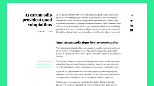
At long last, contextual callouts are possible with CSS grid. Contextual callouts are small paragraphs that sit beside primary text and offer secondary information to a reader. They have long been a feature of books, magazines and other printed materials. I particularly enjoy coming across these small asides when reading, as they add texture and interest to the content.
I have been searching for a while now for a way to bring this to the web with pure CSS. The solutions in the past have typically been fairly messy, requiring annoying floating and clearing, or manual absolute positioning. That is changing now, thanks to CSS grid.
I haven’t found a complete solution to these callouts, but the example here will hopefully work in several situations.
The Grid Markup
Link to this sectionSay I’m building a blog post template. I’ll need a header to contain the title and date, and a section for share links. Then I’ll need the primary blog content, consisting of headings, paragraphs, images, and, yes, callouts. First let’s write some semantic markup:
<article class="blog-post">
  <header class="blog-post-header">
    <h1 class="blog-post-title">...</h1>
    <time datetime="..." class="blog-post-date">...</time>
  </header>
  <aside class="blog-post-share">...</aside>
  <p>...</p>
  <h2>...</h2>
  <p>...</p>
  <aside>
    <p>...</p>
  </aside>
  <p>...</p>
  <p>...</p>
  <aside>
    <p>...</p>
  </aside>
  <figure>
    <img src="..." alt="...">
    <figcaption>...</figcaption>
  </figure>
</article>
The article element contains the header, share links aside, and all post content as direct children. This will be important as we apply CSS grid styles to the post. Callouts are written as aside elements, perfect for content that is connected tangentially to the rest of the document, and appear in the document directly after the paragraph they are connected to.
Fallback Styling (if no CSS Grid support)
Link to this sectionFirst, we’ll apply some basic styles for browsers that don’t yet support CSS grid. We’ll add some margin, padding and set a max-width of 70 characters using the ch unit:
.blog-post {
  max-width: 70ch;
  margin: 3rem auto;
  padding: 1.5rem;
}
The Fun Part: Using CSS Grid!
Link to this sectionNow, progressively enhance for browsers that do support CSS grid using an @supports query:
@supports(display: grid) {
  .blog-post {
    display: grid;
    grid-template-columns: repeat(12, 1fr);
    grid-column-gap: 2rem;
  }
}
Here I’m setting up the .blog-post article as a 12-column grid, each with a width of 1 fraction unit and a gap between each column of 2rem. Now it’s time to start placing content on the grid:
.blog-post-header {
  grid-column-start: 2;
  grid-column-end: span 3;
}

.blog-post p,
.blog-post h2 {
  grid-column-start: 5;
  grid-column-end: span 6;
}

.blog-post-share {
  grid-column-start: span 1;
  grid-column-end: -2;
}
Now, the post header, post paragraphs and headings, and share links all sit next to each other in a row. Pretty cool. The callouts are up next:
.blog-post aside {
  grid-column-start: 3;
  grid-column-end: 5;
}
The asides are now pulled to the left of the paragraph immediately preceding them, looking exactly like callouts. If you wanted more control over the positioning of these callouts (say you wanted one at the bottom of the row, rather than at the top), you could apply some targeted styling with the align-self property, but for this exercise, I’m assuming a more generic approach for content generated from a CMS.
And that’s pretty much all it takes to set up contextual callouts with CSS grid. No sweat.
Bonus: Full-Width Figures
Link to this sectionHere’s my styling for figures within a post, causing them to stretch the full width of the grid container. The rest of the content is still fit to a narrower width.
.blog-post figure {
  display: grid;
  grid-template-columns: repeat(12, 1fr);
  grid-column-gap: 2rem;
  grid-column-start: 1;
  grid-column-end: -1;
}

.blog-post figure img {
  grid-column-start: 1;
  grid-column-end: -1;
}

.blog-post figure figcaption {
  grid-column-start: 5;
  grid-column-end: span 6;
}
I set the figure up to span across all 12 columns of its parent grid. I set up a nested grid within the figure with the same number of columns and spacing as the parent. This allows me to have the img element to span the full width, while the figcaption is aligned with the rest of the primary text in the blog post.
Caveats
Link to this sectionThere is one primary caveat to the approach outlined here. Because row height is determined by the content within the row, it is possible that a caption that is longer than the paragraph to the right of it could elongate that row and create some odd blank space to the right.
Essentially, it is required that all callouts be of equal length or shorter than their preceding paragraphs.
Conclusion
Link to this sectionThat wraps up this one. I’d love to see what other people do with callouts!